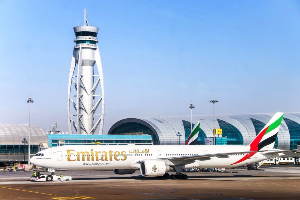
Air Cambodia, formerly known as Air Kam, has recently undergone a significant brand revitalization, unveiling a new and modernized image aimed at expanding its operations within Southeast Asia and boosting tourism in the region. This reinvention marks the airline’s first major update since 2009. The new branding features a dynamic logo inspired by Cambodia’s national bird, the Giant Ibis, symbolizing strength, protection, and prosperity. This strategic move is expected to enhance the airline’s presence and appeal in the competitive travel market of Southeast Asia.
Key Points:
Air Cambodia has launched a completely new and revamped image to aid in its expansion within Southeast Asia and tourism growth.
The airline’s new logo features an 18-feather motif inspired by Cambodia’s national bird, the Giant Ibis, symbolizing strength, protection, and prosperity.
The brand revitalization ceremony took place at Techo International Airport in Phnom Penh, marking the airline’s first reinvention since 2009.
Actionable Takeaways:
Brand Modernization as a Growth Strategy: The introduction of a new, dynamic logo inspired by Cambodia’s national bird signifies a strategic move towards modernization and national pride. This branding effort could enhance Air Cambodia’s market appeal and differentiate it in the competitive Southeast Asian travel market. By associating the airline with national symbols of strength and prosperity, it may attract both domestic and international travelers seeking a culturally resonant travel experience.
Importance of Branding in Travel Industry: The emphasis on a brand refresh highlights the growing importance of branding in the travel industry. Airlines are increasingly leveraging visual identity and cultural symbolism to create a unique market position. This trend suggests that airlines should invest in branding strategies that reflect their national heritage and values, potentially leading to increased customer loyalty and market differentiation.
Contextual Understanding:
The article reflects the ongoing trend in the travel industry towards brand revitalization and modernization. Airlines are recognizing that a strong brand identity can be a powerful tool for differentiation and growth, especially in a crowded market like Southeast Asia. The use of national symbols in branding is not only a strategic move but also a reflection of the broader trend where travel companies are leveraging cultural elements to create a deeper emotional connection with their customers. This approach aligns with the latest travel trends, where personalized and culturally resonant experiences are becoming increasingly important for travelers.
Handling Different Article Types:
The article in question is a news blurb, providing factual information about a significant development in the travel industry. The structured output format ensures that the key points and actionable takeaways are clearly presented, making it easy for readers to digest and apply the information. The contextual insights further enrich the content by linking the article to broader industry trends and expert perspectives, providing a comprehensive view of the subject matter.