


Comprehensive Summarization:
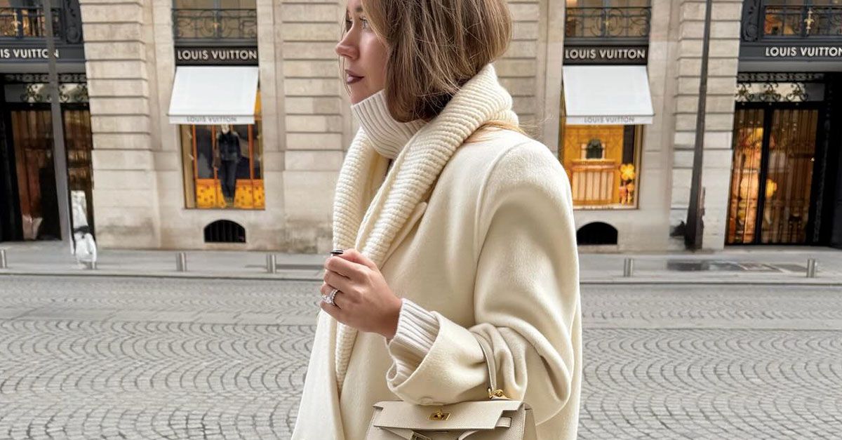
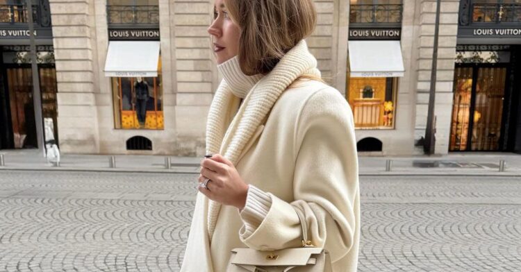
The article discusses the color trends for the 2026 fashion season, ranging from bold and bright primary colors to serene and pillowy soft white hues. Among these, Pantone has named “Cloud Dancer,” a beautiful and billowy shade, as the 2026 Color of the Year. The article also touches on the serene influence of the natural shade of white, which is chosen for its calming effect. While the focus is primarily on fashion, the article subtly hints at the broader implications of color trends in the travel industry, suggesting a shift towards more vibrant and calming aesthetics in travel experiences.
Key Points:
- The 2026 fashion color trends span from bold and bright primary colors to serene and pillowy soft white hues.
- Pantone has named “Cloud Dancer,” a beautiful and billowy shade, as the 2026 Color of the Year.
- The natural shade of white is highlighted for its calming influence, suggesting a trend towards serene aesthetics in travel experiences.
Actionable Takeaways:
-
Incorporate Serene Colors in Travel Experiences: Travel brands can leverage the trend of serene and pillowy soft white hues in their branding and design elements to create a calming and inviting atmosphere for travelers. This could include using these colors in hotel interiors, travel packaging, or digital interfaces, enhancing the overall travel experience by promoting relaxation and tranquility.
-
Utilize Bold and Bright Colors for Attraction: Given the trend towards bold and bright primary colors, travel destinations and service providers can adopt these vibrant colors in their marketing materials, signage, and promotional materials. This can help attract attention and create a memorable impression, making destinations more appealing to travelers seeking excitement and vibrancy.
-
Explore Calming White Hues for Wellness Travel: The emphasis on the calming influence of white can be utilized by wellness-focused travel brands to create serene environments that promote relaxation and rejuvenation. This could involve using white in spa settings, wellness retreats, or eco-friendly accommodations, aligning with the growing demand for holistic and wellness-oriented travel experiences.
Contextual Insights:
The article’s focus on color trends reflects a broader industry shift towards aesthetics that evoke specific emotional responses. In the travel sector, this trend aligns with the increasing consumer demand for experiences that not only offer adventure and exploration but also prioritize comfort and well-being. The Pantone Color of the Year, “Cloud Dancer,” symbolizes a move towards more organic and soothing color palettes, which can be strategically employed by travel brands to enhance the appeal of their offerings. This trend also underscores the importance of visual branding in shaping perceptions and expectations of travel experiences, suggesting that travel companies should invest in thoughtful design and aesthetic choices to stand out in a competitive market. Furthermore, the article hints at the potential for color trends to influence consumer behavior, encouraging brands to innovate and adapt their offerings to align with these evolving preferences.
Read the Complete Article.